Light pollution as topography
- Places without light pollution are remote and can look gorgeous at night
- Topographic views of light pollution resemble huge open pit mines
- The code to generate this is all open source! Tell me what you think
The night sky is beautiful. Much like noise pollution and chemical pollution, anthropogenic sources fuel most of the world’s light pollution, and light pollution strongly correlates with human activity.
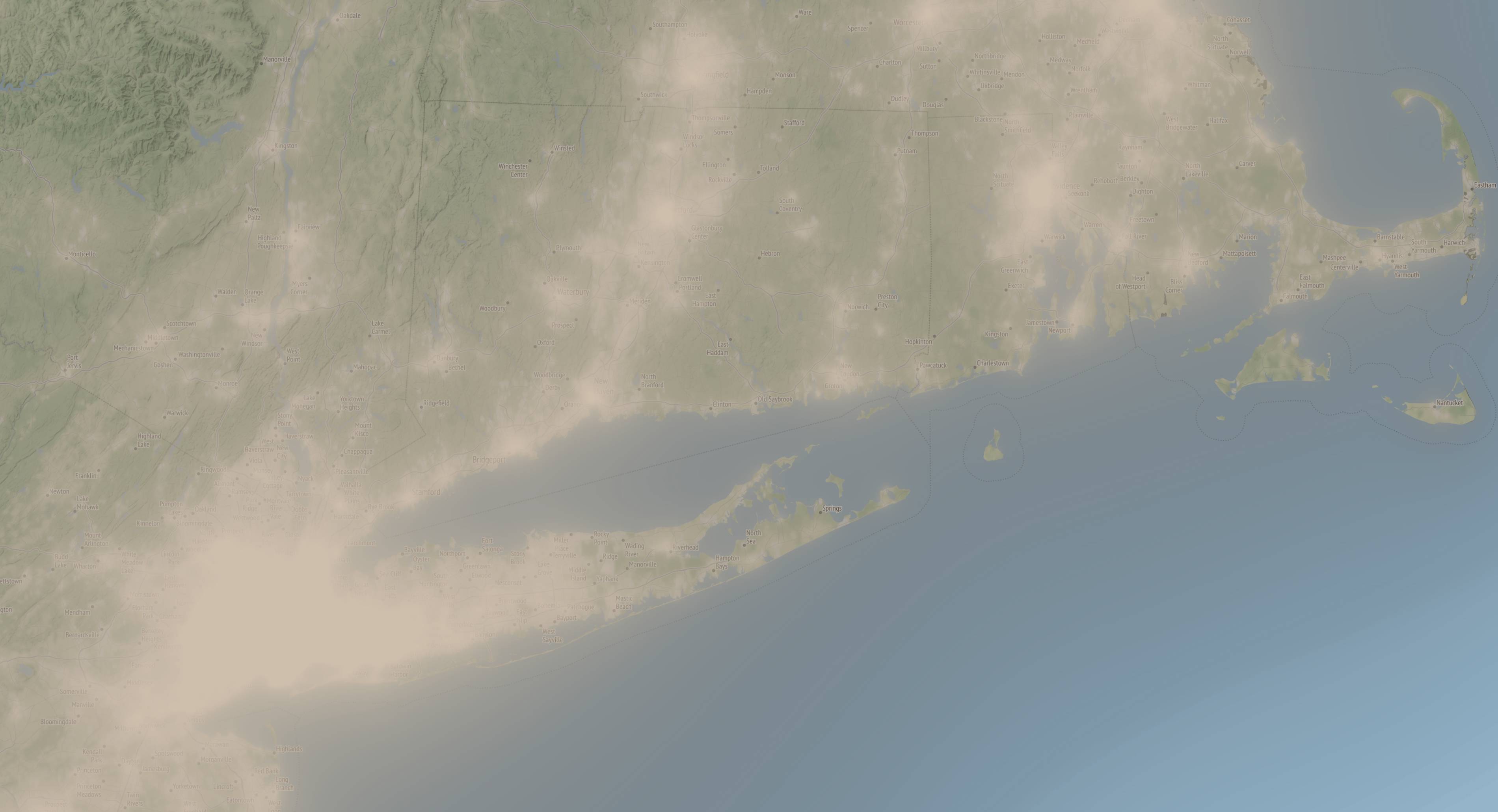
Most often, sites showing light pollution as semi-transparent overlays. This is useful, and can beautifully illustrate the glow over the NYC area:
but another way to visualize the difficulty of escaping the ambient light pollution is to treat it as topography:
like this view above Iceland and Ireland and Britain, resembling
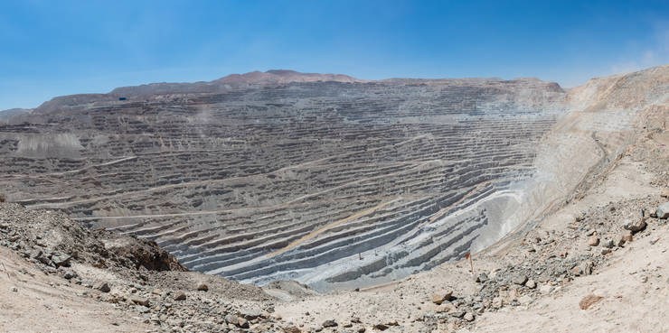
the Chilean open pit Chuquicamata Mine (📸 Diego Delso).
Water and light
The light pollution data from World Atlas 2015 is a 30-arcsecond grid of measurements of brightness over much of the globe, almost a billion observations of millicandelas per square meter (≈ % of a burning wax candle per square human foot). The artistry of a visualization comes in choosing how to quantize these floating-point measurements into pixels.
The eye has a two-trillion-fold range of brightness, so a logarithmic scale allows the visualization to capture minute differences between low-light settings at the expense of minute difference in high-light settings.
The eye starts to see the colors of daytime vision at a brightness of roughly 3 mcd/m². We can call 5 mcd/m² 100%, we can call zero artificial brightness as zero, and logarithmically interpolate between those values. In this model, the brightness of a sky with 1% light polllution (the outer threshold for what the World Atlas 2015 calls “pristine”) encodes as 10-15% polluted, and the brightness of a sky with enough light pollution to make the Milky Way disappear encodes as 75-80% polluted.
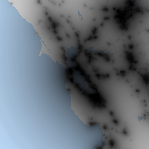
To make a topographic map, we can use deck.gl’s Terrain Layer, which needs a height map and an image to warp to that height, which will display in 3-D the image warped to the height of the terrain. The height map encodes height into R/G/B values of an image. For initial simplicity, we can quantize the light pollution into 256 logarithmically-spaced levels.
If we choose a color for land and a color for water that share equal red or green or blue, we can encode both height and a basic boolean map of land-versus-water with the same image. Choosing white for land (1 red/1 green/1 blue), and light blue for water (¾ red, ⅞ green, 1 blue), means that we can read the height levels from only the blue component, and display the height-map image as a texture over the mesh of the height. In this encoding, the Bay Area is recognizable through purely light pollution (as a proxy for population density) and the boolean characteristic of water for ground cover:
Figure/ground inversion
Many visualizations of light pollution use colors like grey/blue/green/red to distinguish levels of pollution on a map: you can see the base map, with added colors of the ambient light pollution. The map takes on an entirely different look when the light pollution is not the color, but the opacity, and is a grey haze over a map.
Above was a screenshot of this haze over Stamen’s terrain map of the NYC area. We can use other map tiles besides their gorgeous terrain map; their beautiful watercolor tileset (with or without a label tileset) can illustrate the visual din of Las Vegas between the eastern Sierra Nevada and Lake Mead:
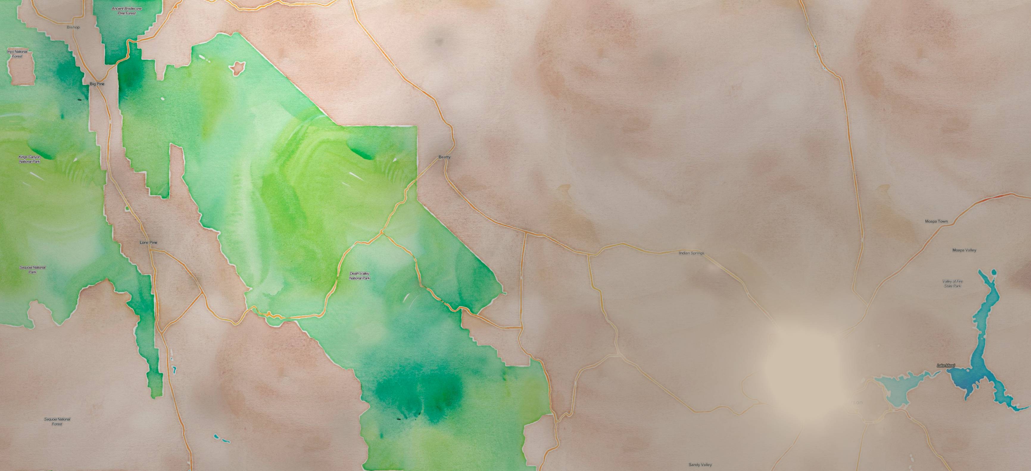
The labels mark one lake, one city, four national and state parks, and half a dozen towns. The light grey haze by Lake Mead, almost the same color as the empty land nearby, completely blots out Nevada’s two largest cities, Nevada’s largest airport, Nevada’s densest thicket of highways.
Many maps prioritize features, like named places and built roads, that correlate with human density, and thus correlate with light pollution. The terrain tiles and the watercolor tiles include roads and parks and names. The light pollution haze transforms these roads into literally roads to nowhere, transforms these town names into literally towns between nowhere and nowhere. The map after this transformation inverts its priorities, and fills with ghost towns and forests and lonely mountains, its least significant bits.
Try this at home!
The light pollution topography map is publicly available, check it out! The source is available for the deck.gl React app that runs it, as well as the Jupyter notebook that generated the tiles from the light pollution.
Try it out and let me know what you think!